Duolingo Experience
Project carried out within the Degree in Integral Design and Image Management - URJC
Duolingo is a website launched on the market in 2011, aimed at learning languages, including English, French, and Italian, among others. Apart from its desktop version, it has native Apps on platforms such as iOS and Android, which have more than 10 million downloads.
The use of the application is completely free, although there is the possibility of making micro-payments to get gems, which unlock the application's features. There is also a Plus version of it.
Despite the fact that Duolingo has been very successful since its launch, and is positioned in the “Top of Mind” of consumers, when it comes to language learning apps, it is not a well-known brand.
This low brand awareness, together with the “freemium” model used by the company, allows us to apply the necessary changes to create a successful transmedia narrative communication model. To achieve a greater presence in the media, we are going to focus on the two main disadvantages that we have analyzed in Duolingo, and that we will analyze in depth during the development of the project:
Use of social networks: Duolingo has a presence on the main social networks, but uses them only to advertise the product, and does not create any link with its potential users through content and “storytelling”.
Null physical presence of the company: In the era of ICTs (Information and Communication Technologies), the digital presence is of vital importance for the maintenance and growth of companies, but since it is the education sector, it is necessary also a physical presence to compete with traditional language school business models.
.
.

These disadvantages will be addressed by following an umbrella brand strategy, which makes it possible to capitalize on the brand image of all the company's products and services, and reduces promotion costs, as it is a brand that is already known to consumers.
Experiencie Duolingo is thus created for managing the transmedia narrative of the brand. In this way, the brand ceases to be a simple application, and becomes an experience, a constant and enriching discovery from and for all media.
"The brand ceases to be a simple application, and becomes an experience, a constant and enriching discovery from and for all media"


Draft
Space
Draft
Graph
Draft
Graph
Draft
Product
Draft
Management
Diagram of the Transmedia narration and its relationship between all the projects.
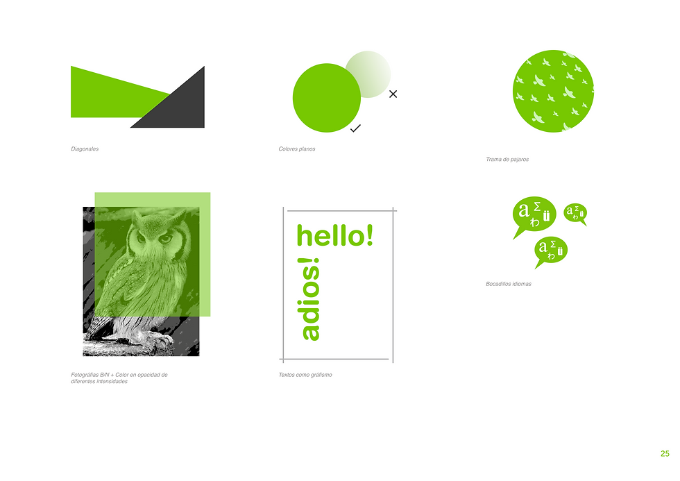
In the background, the image force used to create the division especially in the development of the brand, and within this, the symbol. As you can see, the new division is an open, close and transparent experience where many languages but also cultures and personalities are manifested. This translates into an idea of community, open doors where learning flows naturally. The color goes beyond a strictly chromatic aspect, in the case of Duolingo Experiencie it is captured by an intense green but the intrinsic idea is shown in the dynamism of the birds, in the diagonals and in their direction. As in the image force, united and close, with the aim of a more enjoyable, sensory and emotional learning.
PICTURE
FORCE
1
IDENTITY MANUAL


two
GRAPHIC COMMUNICATION
Esta configuración gráfica se nutre de los elementos citados en el punto “Universo gráfico” de la sección Manual como son el uso de figuras planas y los bocadillos en el eje central. De este modo hay una jerarquía del eje central en el reclamo visual. En lo que respecta a la fotografía se utilizara un plano medio de los actores en el espacio, además serán tratadas bajo los preceptos indicados en el manual.
En el caso particular de este diseño el claim se situa en la parte superior en un fondo homogeneo en fusión con la fotografía inferior, de este modo se enfatiza la sensación de sumergirse o adentrarse en el espectaculo y el aprendizaje.
DATOS TÉCNICOS
-Medidas (cm): 120x175
-Sangrado: 6mm
-Impresión: Offset
-Tintas: (4) Cuatricomía CMYK
-Resolución de impresión: 150 ppp
-Papel: 190gr estucado mate
-Tirada: 300 ejemplares
-Precio 5,58€ unidad. Total: 1674€
GRÁFICA DE LA NARRACIÓN
Go to the image to obtain description, format and measurements.
Esta configuración gráfica se nutre de los elementos citados en el punto “Universo gráfico” de la sección Manual. Los 3 actores principales se situan de forma vertical con una proporción igual para cada uno, ninguno de ellos sobresale sobre el otro. De este modo el espectador aprecia rapidamente la homogeneidad, aunque la lectura occidental le llevara con mucha probabilidad a visualizar a Javier Bardem en primer lugar.
Arriba los nombres, y abajo la información con un espacio reservado para la marca donde las diagonales se conectan; los pajaros vuelan en dirección al claim y este a su vez da paso de arriba hacia abajo a la dirección y la fecha. En resumen, encontramos 4 niveles de peso visual por importancia: fotos de actores, marca “duolingo experience”, claim e información adicional.
DATOS TÉCNICOS
-Medidas (cm): 120x175
-Sangrado: 6mm
-Impresión: Offset
-Tintas: (2) negro + verdiso (Pantone 376 U)
-Resolución de impresión: 150 ppp
-Papel: 190gr estucado mate
-Tirada: 800 ejemplares
-Precio 5,58€ unidad. Total: 4470€
GRÁFICA DE EVENTO
Go to the image to obtain description, format and measurements.

Obverse
FLYERS
Back

CARTELERÍA CLAIM
Este diseño limpio de formas esta creado para captar la presencia del público allí donde se muestre. Su minimalismo pero a la vez potencia de formas y colores hace muy atractivo el aspecto visual, consiguiendo generar expectación. Uso de diagonales, bocadillo y color corporativo con una figura central de alto contraste y el “Claim” al lado, en la parte también central.
Este planteamiento coge reminiscencias de la famosa campaña de apple creada para el iPod en el año 2003 llamada “silhouette”.
Reduced symbol plates

Weft bags
Corporate mugs
Smartphone cases
Stickers
MERCHANDISING
3
APP
5 Screens (the maximum allowed by Apple for the iOS version) are those that make up this navigation tree. In the first place on the left is "Recent Stories" since it is the screen that will be used the most by users. It shows the latest videos uploaded by the Duolingo Experience platform.
The second screen "Learning" has a direct connection with the first since it will show the progress achieved of the idimoa through the visualization of the videos. Also "Calendar" has a connection with the first, in it will appear new videos pending upload and events of the Transmedia headquarters in Matadero-Madrid.
Finally "Headphones" where everything necessary for the configuration of the same and "Settings" that is located near the thumb is gathered.
NAVIGATION TREE


ICONOS MENÚ
Los iconos han sido diseñados completamente en exclusiva para la aplicación. Estan basados en una cuadricula definida donde las diagonales son la seña principal de identidad. Las pantallas que permanecen apagadas tienen fondo oscuro y linea en “Verdiso” mientras que la pantalla seleccionada tiene las lineas en blanco y el fondo en “Verdiso” translucido a un 60%.
-Historias recientes -Aprendizaje -Calendario -Conexión con auriculares -Ajustes
* Iconos versión iOS

Recent Stories

Headphone connection
DISPLAYS
Click on PROTOTYPE to interact.


For the formation of the pilot space and headquarters of the new transmedia company, the "central design" space has been chosen within the "Matadero" complex in the capital of Spain, Madrid. Warehouse 17 of this complex has 350m2 and is located in an excellent transit and communications area. In this way, it will be possible to capture a large volume of public and also, the narration will start from the headquarters to return to it in a transmission circle.
LOCATION

Test and study
in the app
Interpretation
with audiovisual
Storage of
chairs and supplies
interpretation
Loan of
headphones
translators
WC - Toilet

Children's area
Office
Interpretation of
students
Native scenario
professionals

PLANT - DISTRIBUTION


SECTIONS

Pladur® 13mm
RAL 6038 sheet steel
DM wood
oak color
Melamine wood 17mm oak color
Textile-carpet
PANTONE color 376
5 + 5mm tempered glass
Vinyl Avery 713
RAL 7021 paint on brick
Methacrylate
* Monitors
MATERIALS


Click on images to enlarge
In them you can see the distribution of the different elements. The columns separate the space in 2, in this way, a linear of devices has been arranged while on the other side it is distributed between different areas such as the office. Point out the importance of good accessibility, with lower tables for disabled people. In the background you can see the stage in which 3 large screens are integrated.
INTERIOR VIEWS

Interpretation and language practice area, the screen changes depending on the character.


The DUOLINGO experience in transmedia storytelling also involves the creation of a product that serves both for the individual consumption of the user and for its use in space. The headphones created follow the same experiential concept, ascend and feed on content, in turn supporting this experience.
The knowledge expands and the possibilities with it. They can be used both for the selective narration of stories, as well as for personal learning or for free communication between people, all of them are not isolated but make compatible enriching the experience.
INTRODUCTION

INSPIRATION
IDEATION
IMPLEMENTATION

On the left the Pixel Buds headphones from Google, on the right the Mars headphones from Line. The main drawback of both products is the dependence on the smartphone and / or the internet for the translation function since they do not incorporate an internal processor. They also do not have an external speaker for direct communication with another interlocutor. Lastly, they are small in size but their ergonomics and autonomy are more limited.
COMPETENCE


CONSTRUCTION SKETCHES
Click to view other


Cross section
COMPONENTES
Pinche en plano para visualizar vistas del cuerpo
1. Cuerpo - 2. Botón - 3. Altavoz principal interior - 4. Altavoz exterior - 5. Tapa trasera - 6. Patilla - 7. Cúpula altavoz - 8. Tornillos m (x3) - 9. Placa/circuito electrónico - 10. Sensor táctil - 11. Batería litio - 12. Microprocesador - 13. Resorte botón


INTERACTION


* The external loudspeaker allows the interlocutor to be heard directly in his own language.
Sensor
tactile
Outdoor speaker

PROTOTYPES

FINAL PROTOTYPE RESIN

